Kulture Canada - Case Study
Crafting a Modern Wellness Brand Built for Global Shelf Appeal
Elevating a Canadian Wellness Brand with Cohesive Design & Digital Strategy
Client Overview
Kulture Canada approached us with a vision: to build a clean, trustworthy, and design-forward wellness brand that could stand confidently in both retail and digital markets. From brand identity to packaging and a complete Shopify ecommerce ecosystem, our goal was to create a brand that feels premium, modern, and rooted in wellness culture.
We developed a cohesive design system that reflects purity, simplicity, and global appeal — ensuring Kulture Canada resonates with today’s health-conscious consumer.
The Challenge
Kulture Canada was starting from the ground up, without a defined visual identity, packaging direction, or digital presence. The brand needed:
• A logo and identity system that communicated trust and wellness
• Packaging that would look exceptional both on shelves and online
• A Shopify website that feels premium, clean, and conversion-focused
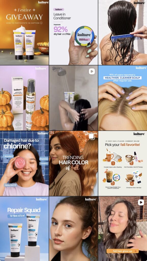
• Social media visuals that build authority and attract a wellness-driven audience
The Strategy
Our approach for Kulture Canada focused on creating a cohesive brand foundation that could scale across digital and physical touchpoints. We began by crafting a distinct visual identity and logo system that reflected the brand’s premium, culturally inspired ethos. From there, we designed packaging that stood out on shelves while staying true to the brand’s core aesthetic. In parallel, we built a Shopify website optimized for conversions, smooth navigation, and storytelling. To strengthen brand recall and community engagement, we implemented a consistent social media strategy that blended education, lifestyle visuals, and product-led content—positioning Kulture Canada as a modern, trusted, and memorable brand.
Logo Design
We created a clean, modern logo inspired by wellness, balance, and simplicity. The mark was designed to be flexible — suitable for packaging lines, product labels, social media, and digital assets.
How We Established Branding For Kulture Canada
A refined brand identity was developed using soft, natural tones and balanced typography. We built a complete brand system including color palettes, fonts, iconography, patterns, and brand guidelines — ensuring Kulture Canada carries a strong and consistent identity across every touchpoint.
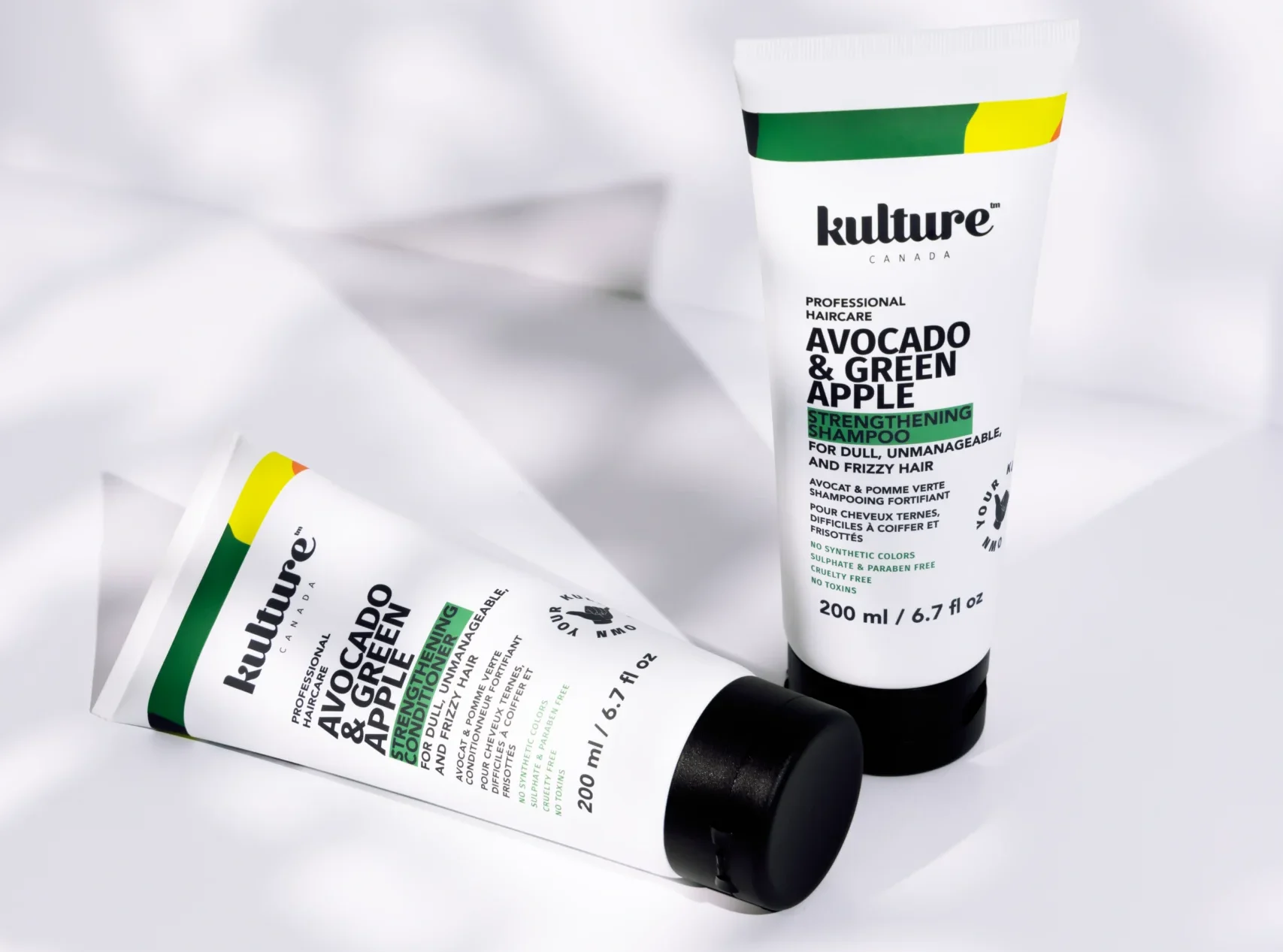
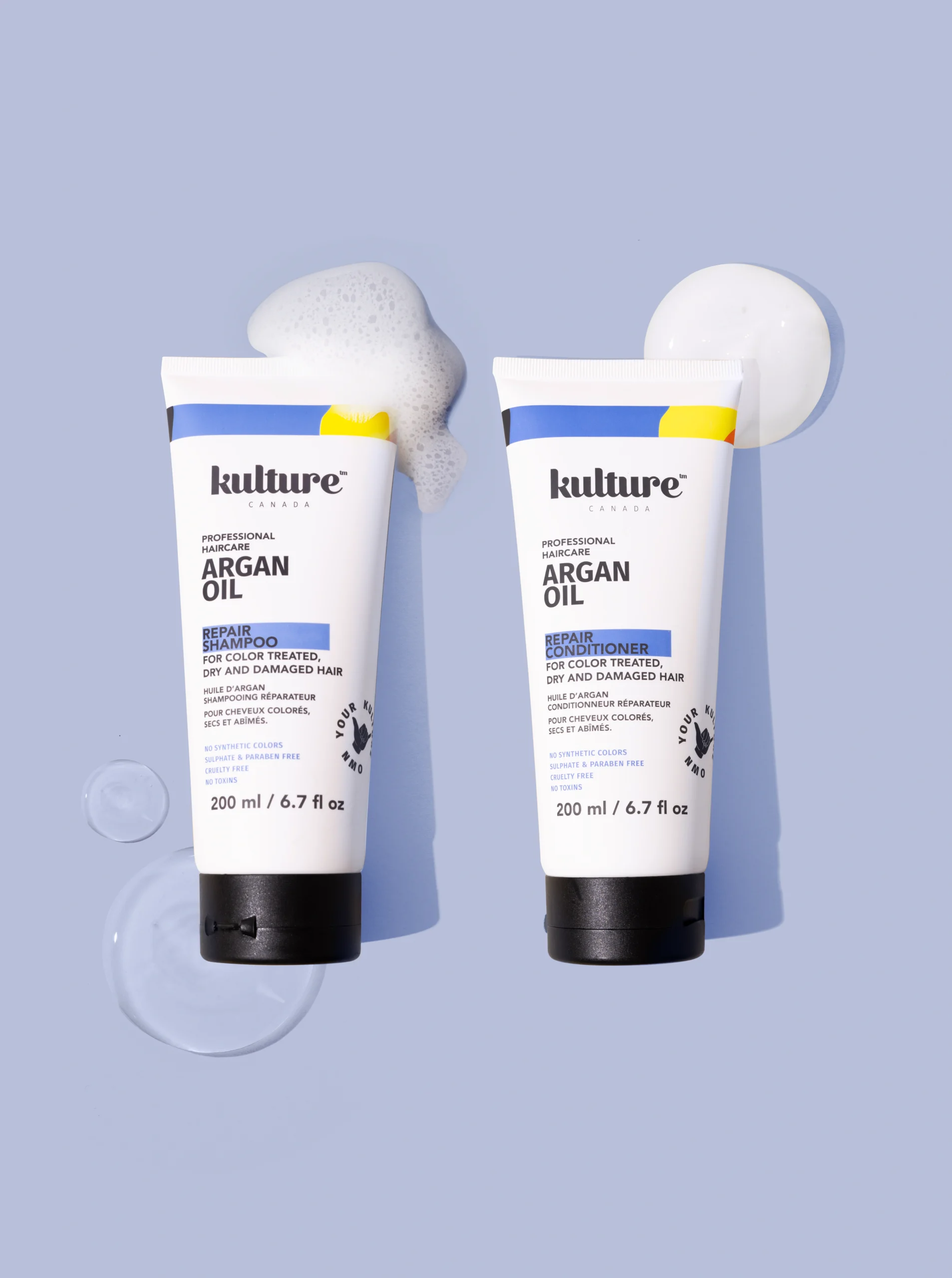
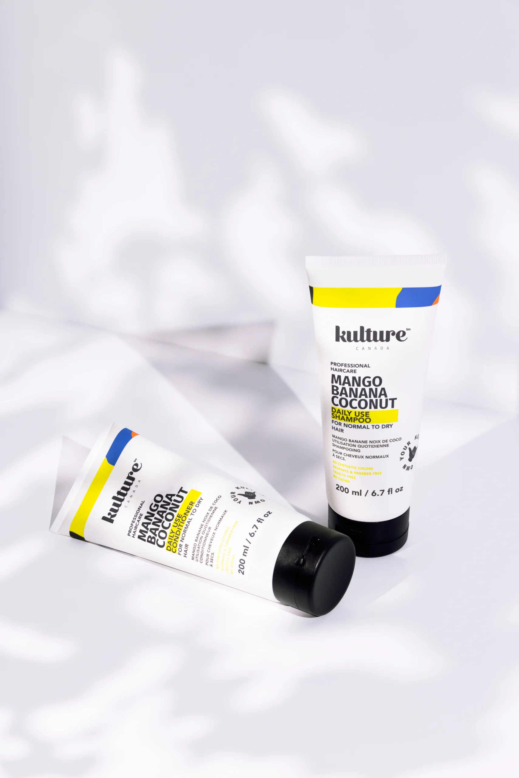
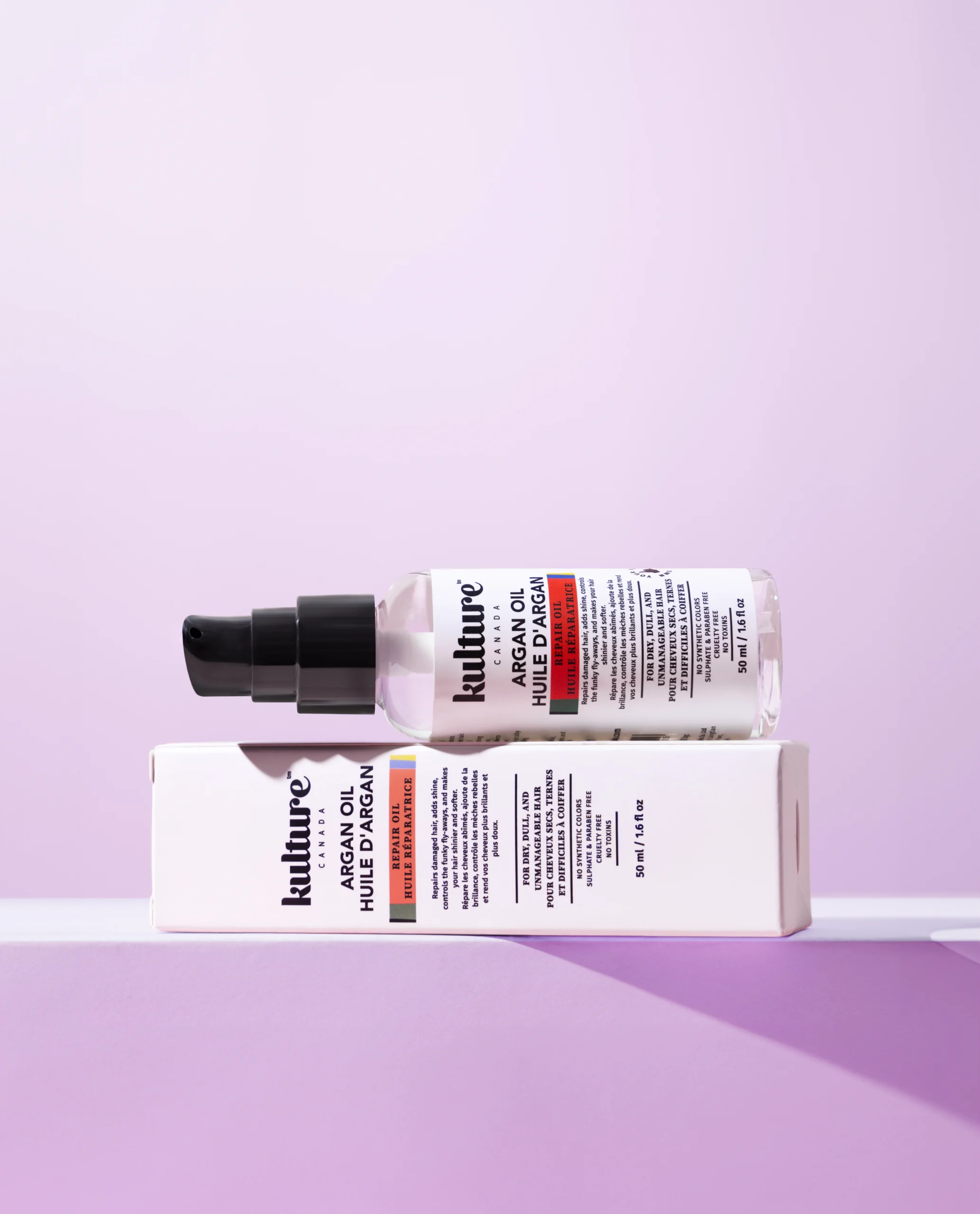
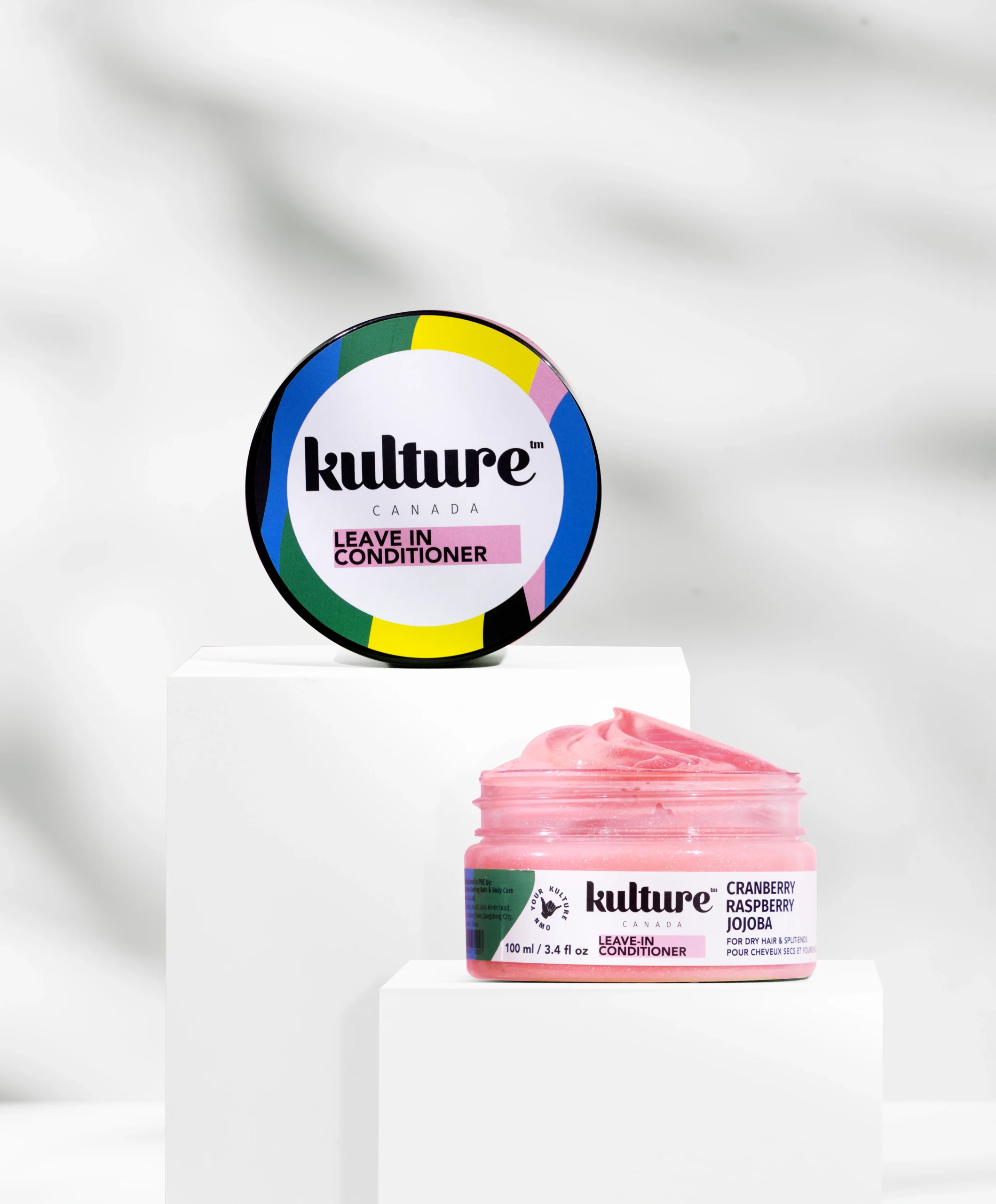
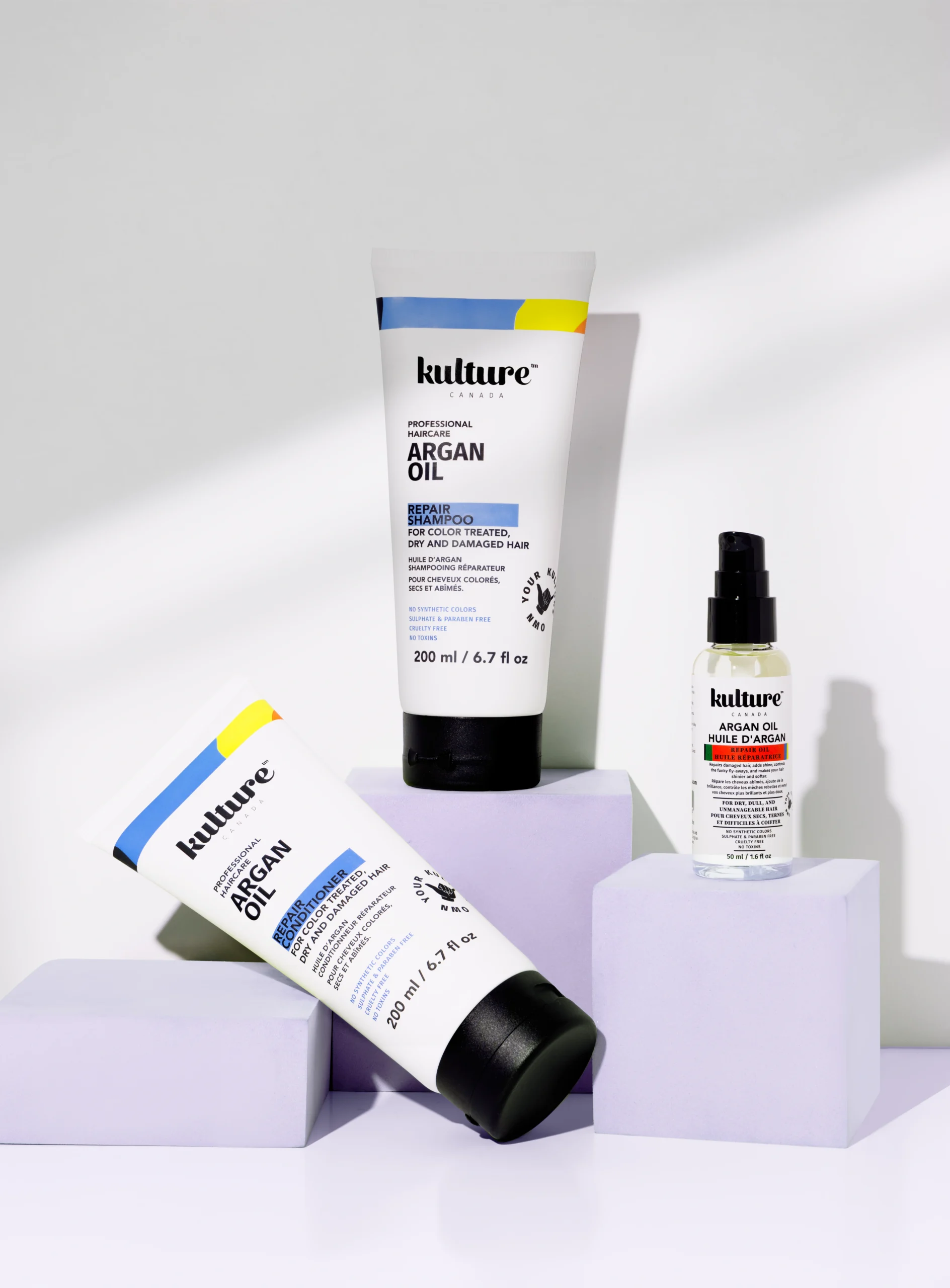
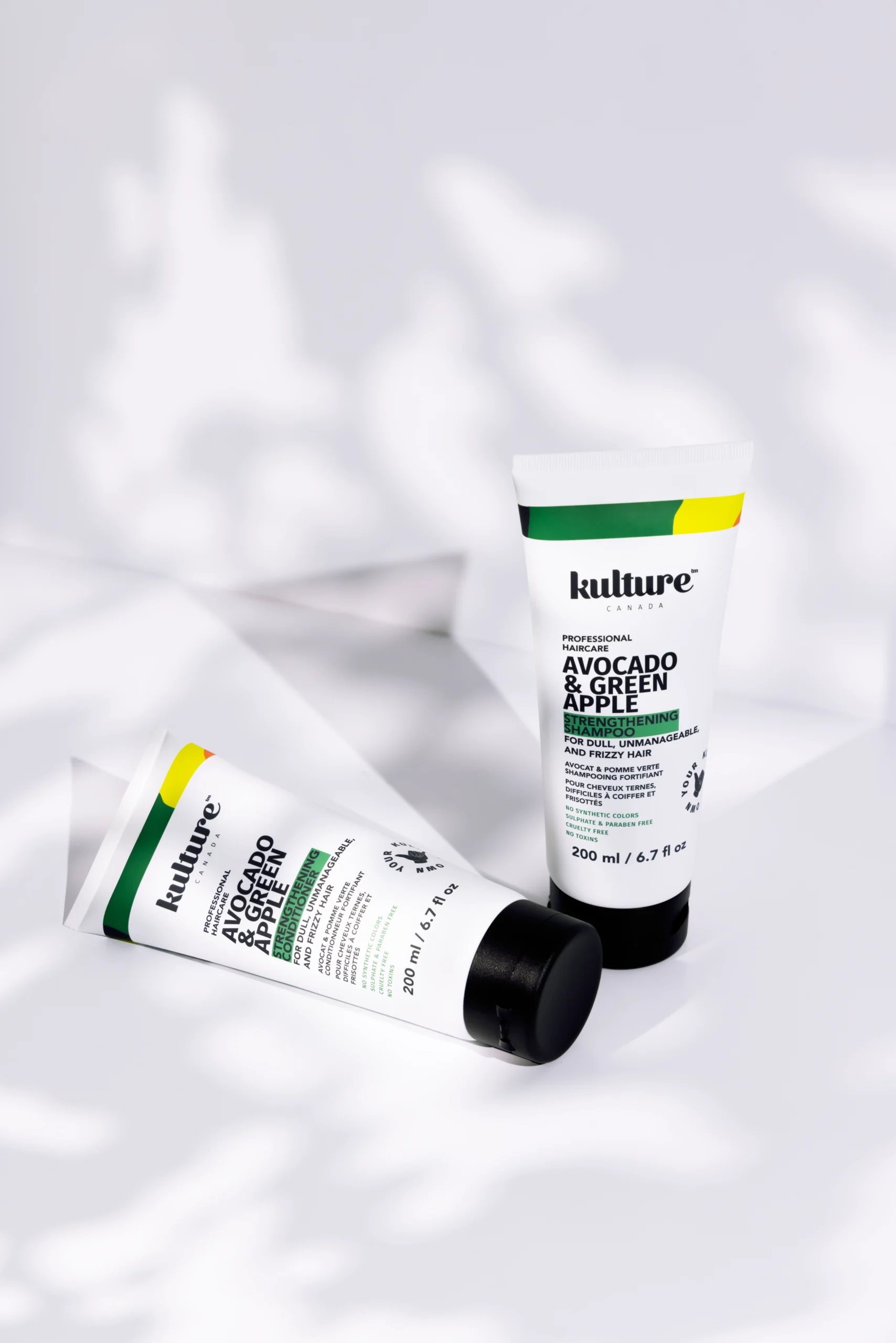
Packaging Design
We crafted packaging that looks refined, fresh, and retail-ready. Each design reflects purity, ingredient transparency, and Canadian-inspired aesthetics — ensuring the brand stands out on shelves and communicates quality at first glance.
The structure, layout, and graphic elements were crafted to enhance clarity, elevate perceived value, and ensure a memorable unboxing experience. From dielines to final print-ready files, every detail was optimized to balance aesthetics with practicality, giving Kulture Canada packaging that feels sophisticated, trustworthy, and instantly recognizable.