Client
Lume
Services
Branding, Packaging Design
Project Overview
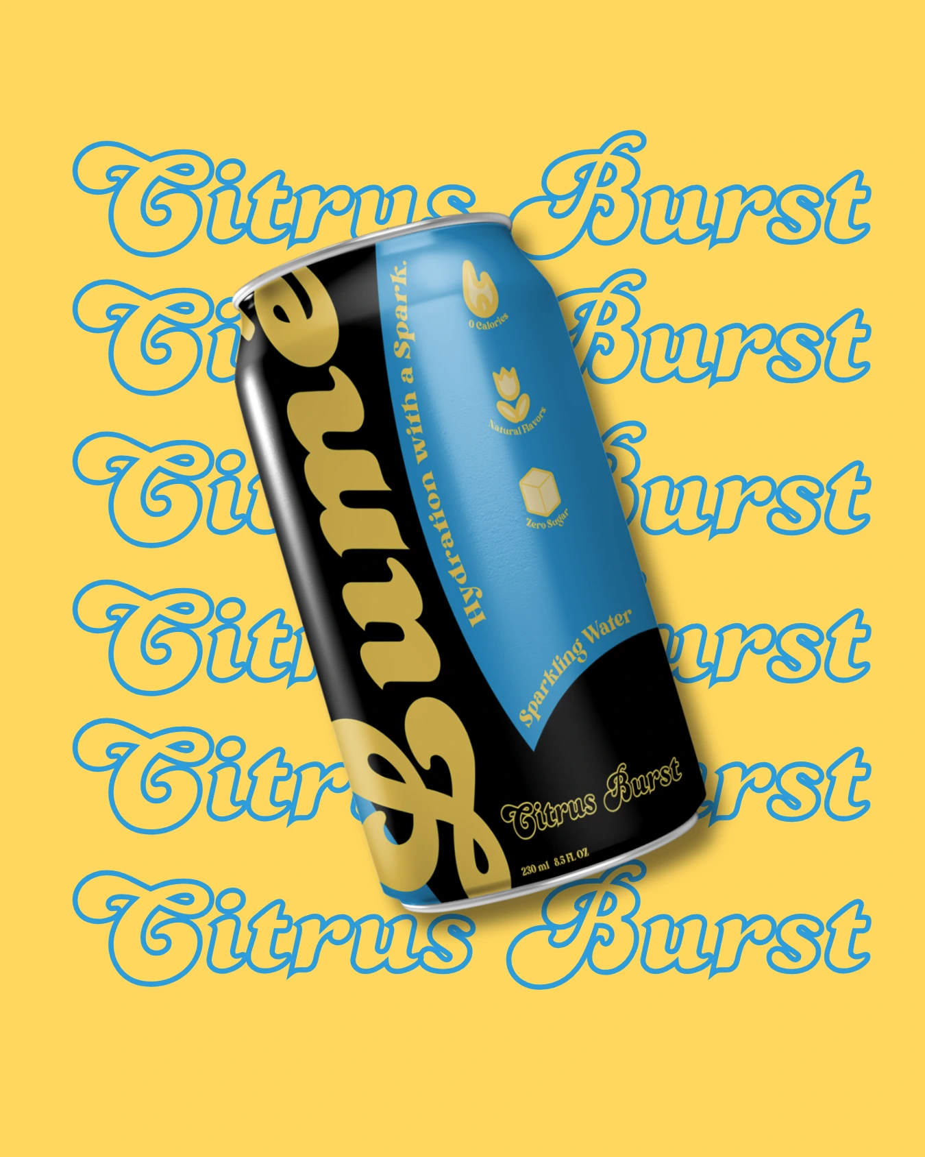
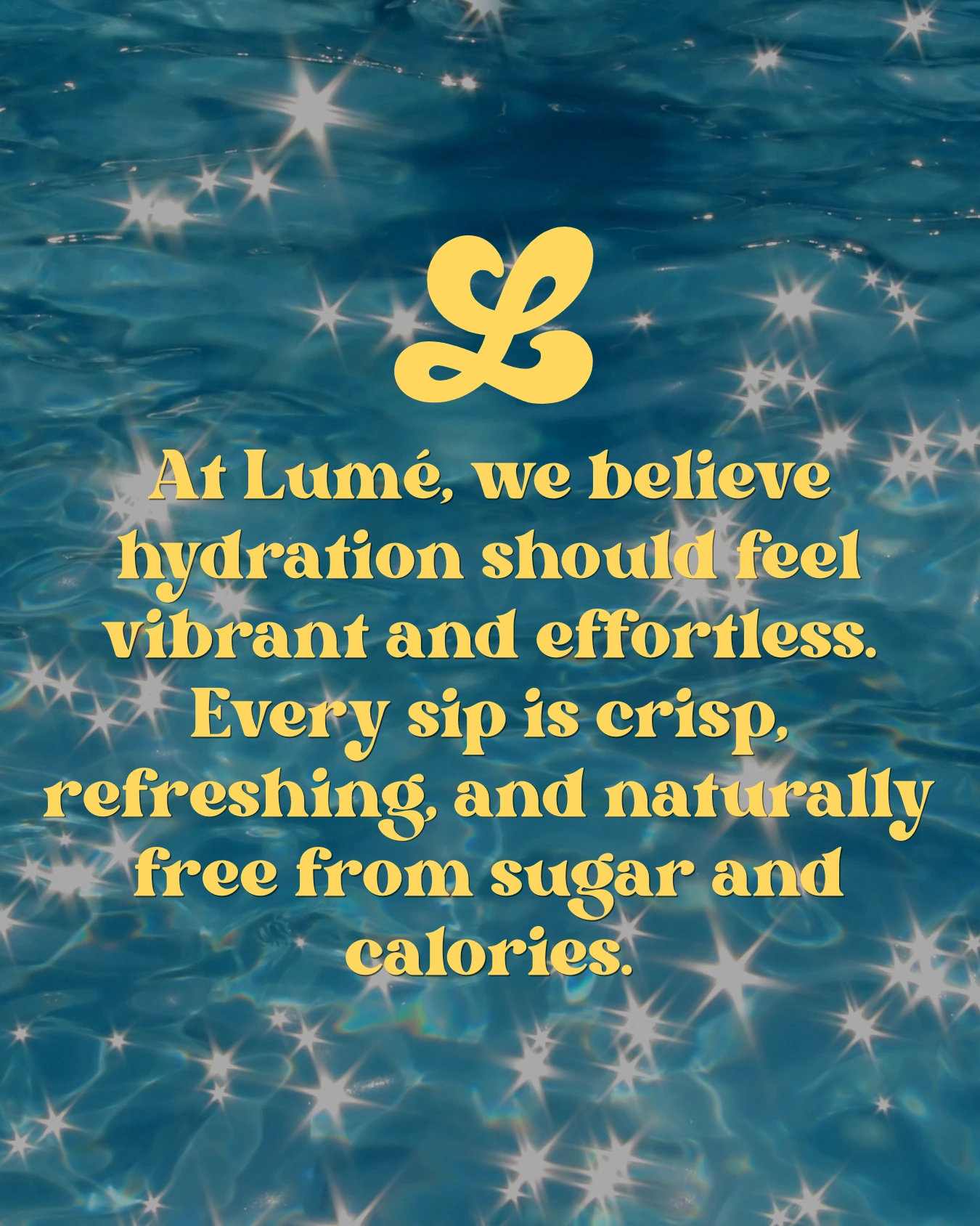
Lumè was built around a simple idea — making hydration feel vibrant, refreshing, and effortless. The product itself delivered on this promise, but the brand identity needed to capture that same energy visually and emotionally.
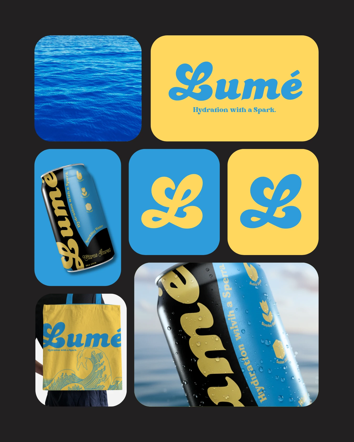
In a category often dominated by generic or overly functional designs, Lumè required a distinct and memorable presence — something that feels light, expressive, and instantly recognizable on the shelf.
The Challenge
Lumè needed a brand identity that could stand out in a saturated beverage market while still communicating clarity and simplicity.
The challenge was to create something visually vibrant without losing structure — a design system that feels fresh and expressive, yet remains clean and easy to understand.
Additionally, the packaging needed to capture attention instantly while maintaining consistency across variations, ensuring strong shelf presence and brand recall.
The Strategy
We focused on building a visual system that feels both energetic and controlled. The approach combined bold color usage with clean typography and minimal layouts — allowing the brand to feel lively without becoming chaotic.
The packaging was designed to highlight product clarity and freshness, using a balance of playful elements and structured composition. This ensured the brand stands out visually while remaining easy to navigate and recognize.